9.6 ANOVA Diagnostics
The preferred method for examining the normality of residuals for us is going to be actually looking at the diagnostics from a fitted model object regardless of the models we choose. This same approach can be applied to t-tests, ANOVA, linear regression, and ANCOVA. We’ll start with ANOVA and wrap up with linear regression.
Here, we will conduct an ANOVA to test the null hypothesis that there is no difference in Stay between years (Year) assuming a Type-I error rate (\(\alpha\)) of 0.05.
We are going to need to change Year to a factor for this analysis.
Fit the model.
The ggplot() function knows just what to do with lm() objects!
ggplot(turdel, aes(x = .fitted, y = .resid, color=Year)) +
  geom_jitter() +
  scale_x_discrete() +
  xlab("Year") +
  ylab(expression(paste(epsilon)))
Cool! But…what the heck are we looking at here??
We have pretty much everything we need here to understand whether we have violated the assumptions of linear models from this graph (other design issues notwithstanding).
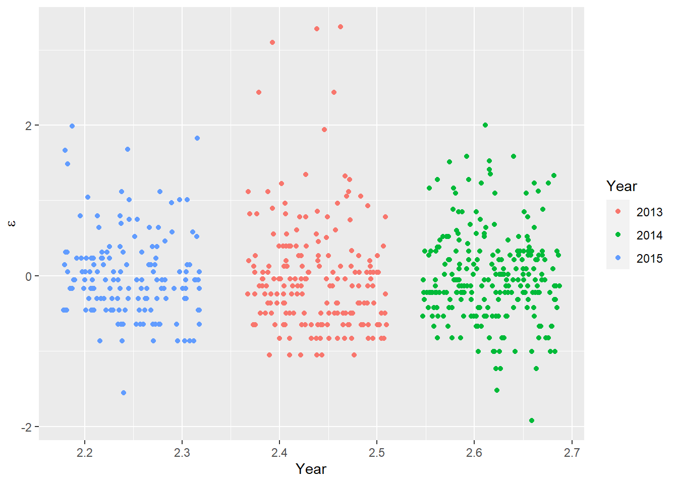
Remember, the mean of the residuals in each group is supposed to be normally distributed with a mean of zero and the variance is equal between groups. Now, I don’t think we need a K-S test or an F-test to say that 1) these resids is def not normal and 2) no way the variances are equal. You can also see that ggplot() has nicely organized our groups in order of increasing magnitude of the residuals from left to right, and that 2013 and 2014 were more variable than 2015.
We can hit the data with a log transformation to see if it fixes any of our problems:
# First fit a model
log_turdel <- lm( log(Stay) ~ Year, data = turtles)

# Now plot the residuals
ggplot(log_turdel, aes(x = .fitted, y = .resid, color=factor(Year))) +
  geom_jitter() +
  scale_color_discrete(name = "Year") +
  xlab("Year") +
  ylab(expression(paste(epsilon)))
In fact, we see that the model fit has improved substantially, although the outliers in our data are still outliers and there is still some skew in the residuals. But, at least now all three years have residuals with a mean near zero and they’re more symmetrical than they were before. You can also see that the groups are now placed more uniformly along the x axis.
If we wanted to investigate further the extent of remaining issues, we could visualize this a little better using a violin plot of the residuals:
# Now plot the residuals
ggplot(log_turdel, aes(x = .fitted, y = .resid, color=factor(Year))) +
  geom_violin() +
  geom_jitter() +
  scale_color_discrete(name = "Year") +
  xlab("Year") +
  ylab(expression(paste(epsilon)))
This plot now shows pretty clearly that the variance in the residuals increases from 2013 to 2015, and that there are a lot more outliers in 2013. But, there aren’t a ton of outliers, so maybe this is something we could accomodate with the right assumptions about our sampling distribution down the road.
Notice that we still haven’t looked at the model results yet? That’s not just because this is The Worst Stats Text eveR.