10.4 ANCOVA
Now, we are going to step up the complexity a little bit and start to look at how to interpret linear models with more than one variable, and more than one variable type. Exciting, I know!
Last week we worked with the crickets data to demonstrate ANCOVA. Let’s keep working with that one.
# Read cricket data
# This data set contains pulses of
# 2 species of crickets collected under
# varying temperatures
  crickets <- read.csv('data/crickets.txt')
We investigated the additive effects of Species and temperature (Temp) on chirpy pulses of individual crickets and found significant evidence of both.
Here is the summary of the linear model:
##
## Call:
## lm(formula = Pulse ~ Species + Temp, data = crickets)
##
## Residuals:
##     Min      1Q  Median      3Q     Max
## -3.0128 -1.1296 -0.3912  0.9650  3.7800
##
## Coefficients:
##              Estimate Std. Error t value Pr(>|t|)
## (Intercept)  -7.21091    2.55094  -2.827  0.00858 **
## Speciesniv  -10.06529    0.73526 -13.689 6.27e-14 ***
## Temp          3.60275    0.09729  37.032  < 2e-16 ***
## ---
## Signif. codes:  0 '***' 0.001 '**' 0.01 '*' 0.05 '.' 0.1 ' ' 1
##
## Residual standard error: 1.786 on 28 degrees of freedom
## Multiple R-squared:  0.9896,	Adjusted R-squared:  0.9888
## F-statistic:  1331 on 2 and 28 DF,  p-value: < 2.2e-16
And the model matrix:
You can see that the model matrix still has a column for the (Intercept) that represents Species ex and a dummy variable called Speciesniv to indicate rows in the cricket data where Species == niv. But, now we also have a column in the model matrix for a continuous variable. Not to fear, the math works exactly the same way as it did for ANOVA and for linear regression.
10.4.1 Prediction
We could do this using linear algebra (matrix math). Note that the math has stayed the same for ANOVA, regression and ANCOVA. That is because they are all just different special cases of the same general model.
X_pred <- as.matrix(model.matrix(cricket.mod))
betas <- cricket.mod$coefficients

# Multiply betas by dummy coded
# matrix using transpose of both
# These are your predictions
# for ctrl, trt1, and trt2
y_pred <- as.vector( t(betas) %*% t(X_pred) )

cricket_pred <- data.frame(crickets, y_pred)
But since it is a pain to get prediction intervals like this, we’ll use the default predict() function here as well. I am not going to lie, I am literally just copying and pasting code from ANOVA and regression here and changing the names. This is the power of understanding what actually goes on under the hood for us!
10.4.2 Plotting
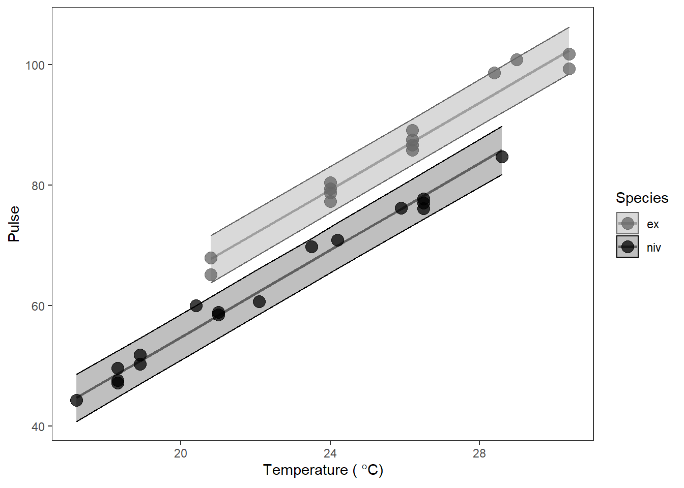
Plot the predictions by species. Again, I am pretty much changing the names of the data and the colors at this point. Who’d have thought that fitting and and making predictions from scary ANCOVA models could be so easy!? Dangerously easy…
In this case, though, we should expect to see two lines on our graph if I have not completely lied to you. This is because we have both categorical and continuous explanatory variables in X. Remember that the \(\beta\)s for categorical variables are just adjustments or offsets to the intercept in linear models. That means that we should have two parallel lines given that we had two groups (so one intercept + 1 offset) and a single slope.
# Make a pretty plot showing raw data and model predictions
ggplot(cricket_pred, aes(x = Temp, y = Pulse, group = Species)) +
  geom_point(aes(colour = Species, fill = Species), alpha = 0.75, size = 4) +
  geom_line( aes(y = fit, color = Species), size = 1, alpha = .5) +
  geom_ribbon(aes(ymin = lwr, ymax = upr, color = Species, fill = Species),
              alpha = 0.25) +
  scale_fill_manual(values = c('gray40', 'black')) +
  scale_color_manual(values = c('gray40', 'black')) +
  xlab(expression(paste("Temperature ( ", degree, "C)"))) +
  theme_bw() +
  theme(panel.grid = element_blank())
Ta-da!