8.5 Predictions
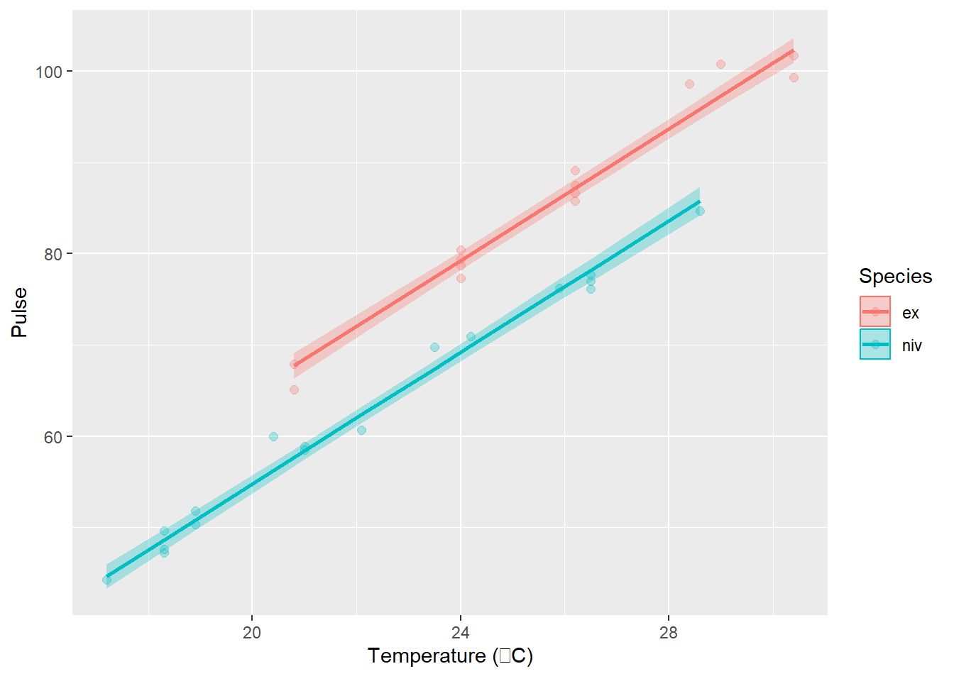
Here we will take a quick look at how to plot model predictions over our raw data to demonstrate the relationships we have discovered and to show how they compare to our observations. We should have a separate line for each group based on differences in Pulse between species, but the lines should be parallel based on how our model was formulated. Again, we will dig deep into why this is the case in Chapter 10.
Note that this procedure is identical to the one we used for linear regression. That is because linear regression is just one special case of the general linear model!
# Make predictions from the fitted model object using observed data
predicted_pulse = predict(cricket_mod, interval = 'confidence')

# Add these to the cricket data
cricket_pred <- cbind(crickets, predicted_pulse)
Now, we can plot the raw data as a scatterplot and add our model estimates over the top just like we did for the swiss data in Chapter 4.
# Sets up data and aesthetics
ggplot(cricket_pred,
       aes(x = Temp, y = Pulse, color = Species, fill = Species)) +
  geom_point(alpha = 0.3, size = 2) +
  geom_line(aes(y = fit), size = 1) +
  geom_ribbon(aes(ymin = lwr, ymax = upr, color = NULL), alpha = .3)+
xlab(expression(paste('Temperature (', degree, 'C)'))) 