18.3 Negative binomial regression
Okay, moving on with life, let’s take a look at the negative binomial regression model as an alternative to Poisson regression. Truthfully, this is usually where I start these days, and then I might consider backing down to use of Poisson if all assumptions are actually verified (but, this has literally never happened for me).
We will start this time by actually doing some data exploration before our analysis. This is really how we should have started above, but that would have ruined all the fun.
First, look at the distribution of the data. Here, it should be pretty obvious to you by now that these are count data for which the mean is not equal to the variance…right?

If you think back to Chapter 5, you’ll remember this is a pretty typical example of the negative binomial distribution.
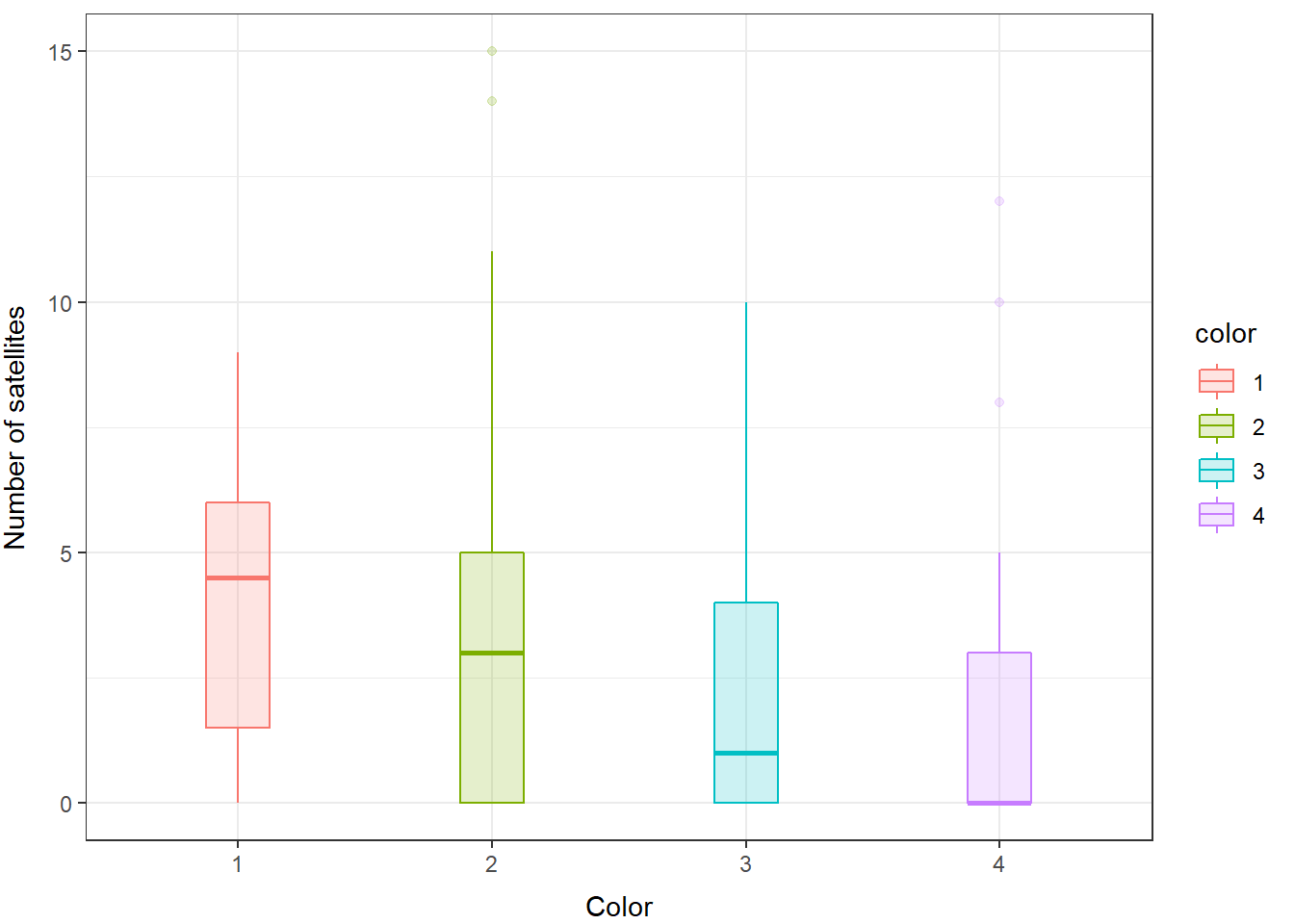
We can take a look at how this shakes out between our groups (color) as well.
ggplot(
  crabs,
  aes(x = color, y = satellites, color = color, fill = color)) +
  geom_boxplot(alpha = 0.20, width = 0.25) +
  xlab("Color") +
  ylab("Number of satellites") +
  theme_bw() +
  theme(
    axis.title.x = element_text(vjust = -1),
    axis.title.y = element_text(vjust = 3)
  )
And, you can see here that even within groups the distributions do not look like they are normal or like they have equal variances, so we will fit a GLM that assumes the response is drawn from a negative binomial distribution.
We can fit it with the GLM function like this using rstanarm:
# Fit a model
negbin_mod <- stan_glm(
  satellites ~ width + mass + spine + color,
  data = crabs,
  family = neg_binomial_2()
)
Play around with the two formulations above and see if there’s a difference. Clue: there’s not, really. Just two different ways to do the same thing. The functionality in the glm function only came around recently, that’s all.
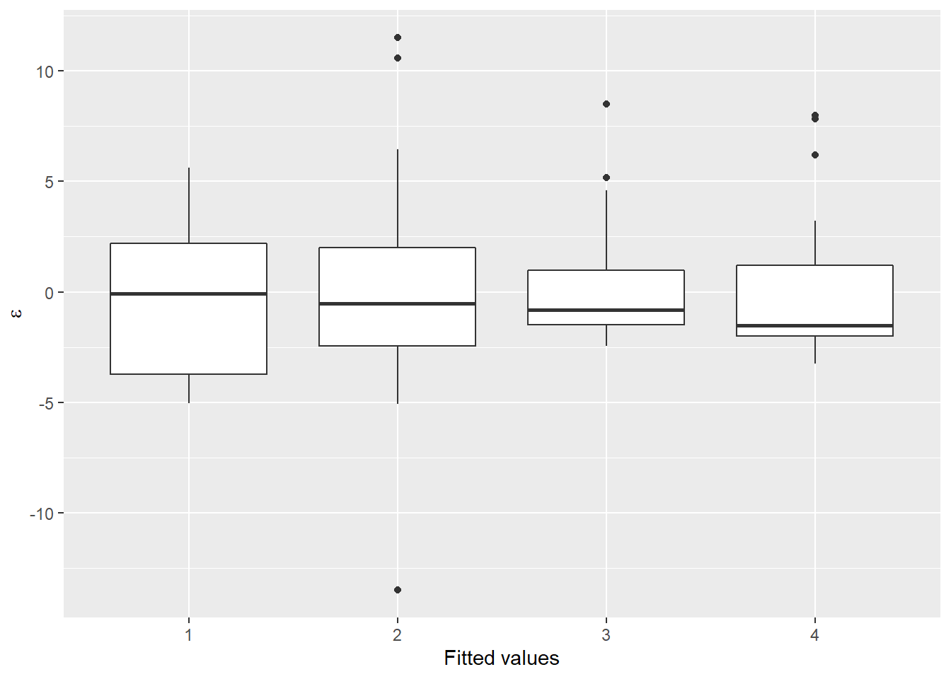
Now, let’s take a look at the distribution of the residuals. I am going to work with the object I fit using the glm() function. This time, we’ll split our residuals out by color group so we can see where the problems are
resids <- data.frame(.fitted = negbin_mod$fitted.values,
                     .resid = negbin_mod$residuals)

crab_resids <- data.frame(crabs, resids)
Now, we can plot them:
ggplot(crab_resids, aes(x = color, y = .resid)) +
  geom_boxplot() +
  xlab("Fitted values") +
  ylab(expression(paste(epsilon)))
Now we are starting to look a lot more “normal” within groups, and we are getting more symmetrical in our residual sampling distributions. However, just as in Chapter 13, we notice that all the means in our boxplot above seem to be less than zero, which suggests some systematic bias in our residuals.
But, how does this compare to the Poisson model for count data? We can use model selection to compare the Poisson model to the negative binomial model, since the response is the same in both cases.
We can extract the estimated log likelihoods directly from the models:
And we can compute LOO-IC statistics using the loo package. Notice that here we get some warnings suggesting there are one or more problem observations (!) in the Poisson fit (“too high” or > 0.70) that seem to be mostly resolved using the negative binomial fit (“slightly high” or > 0.50).
Then, we can compare the models directly because they use the same response and link function:
##        elpd_diff se_diff
## model2   0.0       0.0
## model1 -87.7      19.0
The negative binomial model is clearly superior to the Poisson model here.
Now, with a reasonable model in hand we could proceed with data visualization, but we might also rather have a “good” model to work with instead of just one that is “good enough”. It turns out that the real problem behind the weirdness in our residuals is actually due to an excess number of zero counts of satellite males on a lot of our females. This is very common in count data, where we might observe a lot of zeros before actually counting a success. For these cases, we’ll need to deal with the issue these excessive zeros (“zero inflation”) directly.