6.3 Frequency analysis
Now, what if we didn’t collect very good data, or we binned our data into low-resolution categories for the sake of ease in our study design? Often, and for a variety of reasons other than crappy data collection, we want to compare frequencies of events between two (or more) groups. We may even design studies specifically to test these kinds of hypotheses when we think about rates, for example. This is very common in studies of population genetics [definitely citations available for that one - go Google them]
The simplest way to test for differences in the frequency of a categorical response between two groups is (some would argue) the \(\chi^2\) test. The \(\chi^2\) is another one of those that you should really work out by hand because it is used in a variety of settings “under the hood” of more complex routines. Here is your token video link showing an example. Watch it. Please.
6.3.1 Worked example
Let’s say we want to know if the number of grass carp in a given age group (say age 10) varies between years. These fish are sterile hybrids, so we would expect that the number of fish in each age would change drastically with increasing time since the year of initial stocking (1995).
First, make a table showing the number of fish in each Age by Year with the grasscarp data.
##     Year
## Age  2006 2007 2009 2010 2017
##   1     0    0    0    2    0
##   2     6    7    7    8    0
##   3    11   10   10   14    3
##   4     4    3    6    3    3
##   5     0    1    3    2   10
##   6     0    1    2    1   12
##   7     0    0    1    3   11
##   8     0    1    1    2   12
##   9     1    0    1    3   21
##   10    4    1    1    2   21
##   11    4    9    0    6   15
##   12    3   15    2    3   18
##   13    0    1    4    3    7
##   14    0    0   11    8    6
##   15    0    0    2   12   12
##   16    0    0    0    2   10
##   17    0    0    0    0    8
##   18    0    0    0    0    9
##   19    0    0    0    0   12
##   20    0    0    0    0   12
##   21    0    0    0    0    5
##   22    0    0    0    0    3
##   23    0    0    0    0    2
Basically what we are going to do is analyze the proportion of total fish in each column by age.
You should see some pretty obvious patterns here. We have a couple of things to think about now. First, this is the kind of question you don’t need statistics for. Second, we have a whole bunch of empty groups, and these are not random with respect to year. Some of these come from ages that were not yet available in years 2006 - 2010 and some from patterns in fish stocking. The large number of empty pairings and the fact that most age classes had fewer than five fish in any year prior to 2017 means we should probably break the data down a little further. This stinks because we lose resolution, but that is the cost.
For the sake of demonstration, let’s summarize the data by high and low density again and we’ll look at the number of fish collected in each age class during high and low density years.
freqs <- grasscarp %>% # Pass grass carp data frame to group_by()
    filter(Age %in% c(10:15)) # Select only shared age range

head(freqs)
## Year Length Weight_kg Age cohort n_stocked n acre ha nha kg kg_ha
## 1 2006 1262 23.154 12 1994 7000 25128 2957 1203 21 129929 108
## 2 2006 1138 23.923 10 1996 7000 25128 2957 1203 21 129929 108
## 3 2006 1187 18.614 10 1996 7000 25128 2957 1203 21 129929 108
## 4 2006 1207 19.522 12 1994 7000 25128 2957 1203 21 129929 108
## 5 2006 1086 21.285 10 1996 7000 25128 2957 1203 21 129929 108
## 6 2006 1095 18.160 12 1994 7000 25128 2957 1203 21 129929 108
## density
## 1 low
## 2 low
## 3 low
## 4 low
## 5 low
## 6 lowWe will test the null hypothesis that there is no difference in the number of age-10 fish between high and low densities.
# Run the test
chi_test <- with(freqs, chisq.test(x = density, y = Age))

# Have a look
print(chi_test)
##
## Pearson's Chi-squared test
##
## data: density and Age
## X-squared = 13.107, df = 5, p-value = 0.0224And, bam! We see that there is a difference in the frequency of fish collected in each age class in high and low density years. Shocker.
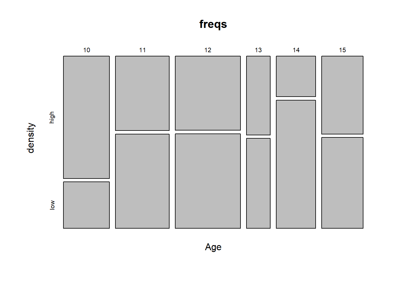
Data visualization techniques for contingency table analyses like this seem to have generally lagged behind theory in terms of wide-spread implementation. There is a base R mosaicplot that plots relative freqencies. You can interpret the width of the bars as the proportion of total observations in each age class. Likewise, the height of the vertical segnmens corresponds to proportion of high or low density observations in each Age.

The need for improved graphical representation for these data types is recognized. There have been recent efforts to extend the philosophies used ggplot() to contingency analysis by r developers (see Wickham and Hofmann 2011). It was even the topic of a recent master’s thesis (see Grant 2017). But as far as I know the ideas from these works have not been integrated into ggplot2 or the tidyverse yet. Sorry about the citations. I don’t know what I was thinking. This is supposed to be the Worst Stats Text eveR.