19.3 Worked example
Let’s start by loading the data set. This is the same data set introduced in Chapter 14.4. For this chapter, I will leave the extended explanation from Chapter 14 to help place the R code within the context of the models we are building.
# Read in the data file
# We are reading it in with the optional
# argument because we don't want to deal
# with code relicts if we start
# dropping factor levels
cray <- read.csv("data/cray.csv", stringsAsFactors = FALSE)## 'data.frame': 964 obs. of 7 variables:
## $ date : chr "6/28/2018" "6/28/2018" "6/28/2018" "6/28/2018" ...
## $ waterbody: chr "Susquehanna River" "Susquehanna River" "Susquehanna River" "Susquehanna River" ...
## $ site : chr "Cooperstown Dam" "Cooperstown Dam" "Cooperstown Dam" "Cooperstown Dam" ...
## $ length : num 30.9 31.2 31.1 29.3 28.3 ...
## $ mass : num 7.18 6.85 6.75 6.46 6.14 5.99 5.58 4.95 4.85 4.81 ...
## $ loglength: num 3.43 3.44 3.44 3.38 3.34 ...
## $ logmass : num 1.97 1.92 1.91 1.87 1.81 ...## date waterbody site length mass loglength logmass
## 1 6/28/2018 Susquehanna River Cooperstown Dam 30.88 7.18 3.430109 1.971299
## 2 6/28/2018 Susquehanna River Cooperstown Dam 31.18 6.85 3.439777 1.924249
## 3 6/28/2018 Susquehanna River Cooperstown Dam 31.15 6.75 3.438814 1.909543
## 4 6/28/2018 Susquehanna River Cooperstown Dam 29.28 6.46 3.376905 1.865629
## 5 6/28/2018 Susquehanna River Cooperstown Dam 28.31 6.14 3.343215 1.814825
## 6 6/28/2018 Susquehanna River Cooperstown Dam 30.55 5.99 3.419365 1.790091This is a fairly straightforward data set. There are 964 observations of 7 variables. Each of the observations (rows) corresponds to a rusty crayfish that was collected and measured (length in mm and mass in g) at one of several sites on a given date. The variable catch is the total number caught by electrobugging over a given time (minutes). To compare density between sites, catch was divided by (time/60) to calculate catch per unit effort (cpue) as number of crayfish per hour. Therefore, observations of cpue, catch, and time correspond to unique date and site combinations, but length and mass represent unique individuals within site and date.
Our primary objective in this study was to collect baseline data. But curiosity led us to explore variation in the condition of crayfish when we thought we were noticing skinnier crayfish in sites of higher density. Length-weight regressions are one tool that is commonly used to investigate changes in volumetric growth with increasing length. In the absence of a standardized condition metric such as that widely applied in fish populations, relative weight (Wr), we thought this might offer some insight into variability in condition.
What follows is a steroid-injected version of the analysis we started with.
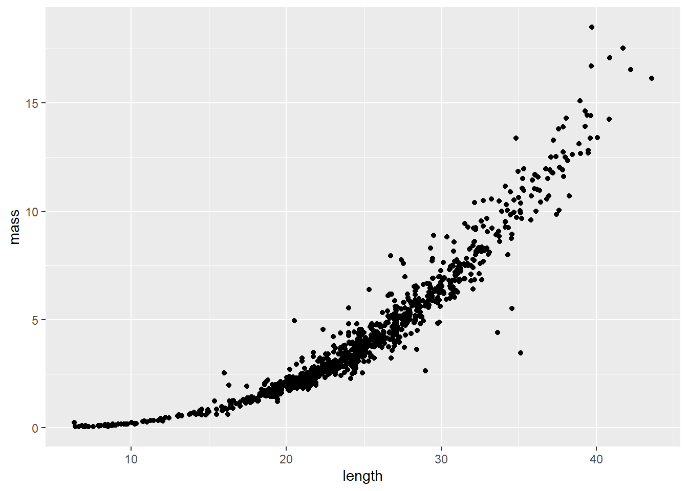
Length-weight relationships in animals are generally parameterized by log-transforming length and mass. This is because the relationship between the two is exponential, or can be described using a power function (ouch, think back to intro bio). For a given unit increase in length, we expect mass to increase as an approximately cubic function of length.
We can see this in our un-transformed data pretty cleanly:
The relationship depicted above can be expressed mathematically as:
\[W = aL^b,\]
and statistically as:
\[W_i = a {L_i}^b e^{\epsilon_i},\]
where \(W_i\) is mass (weight) of individual \(_i\), \(L_i\) is length of the individual, \(a\) and \(b\) are the coefficient and exponent describing change in mass as a function of length, and \(\epsilon_i\) is the multiplicative error term for each crayfish (residuals change with length). Here, \(b\) also has interpretation relative to allometry in growth patterns, where values of 3.0 indicate isometry, values below 3 indicate negative allometry, and values above 3 indicate positive allometry in the length-weight relationship. This means that at values much above 3, we would expect individuals to get heavier faster relative to their length at large sizes.
We can certainly estimate this kind of relationship using nonlinear regression. But, nonlinear regression can get a little unstable due to inherent correlations between parameters, and the multiplicative error described above, even when using Bayesian estimation. So, it can be easier to log-transform both sides of the equation to make the relationship linear and achieve a constant error across the range of X (homoscedasticity). As a result, we generally linearize relationships like this to improve modeling whenever we can, in this case by taking the natural logarithm of both sides of the equation:
\[log(W_i) = log(a) + b \cdot log(L_i) + \epsilon_i\]
Now, that should look a whole lot like the linear models we have been talking about all semester. In fact, by substitution, we could say that:
\[Y = \beta_0 + \beta_1 \cdot X_i + \epsilon_i\]
where \(Y\) is log(mass), and \(X\) is log(length). Then, we just need to remember that \(\beta_0\) is estimated on the log scale.
We can take a look at how this looks in our data by plotting the transformed data.
Start by log-transforming length and mass
Plot the relationship. Note that only the names have been changed.
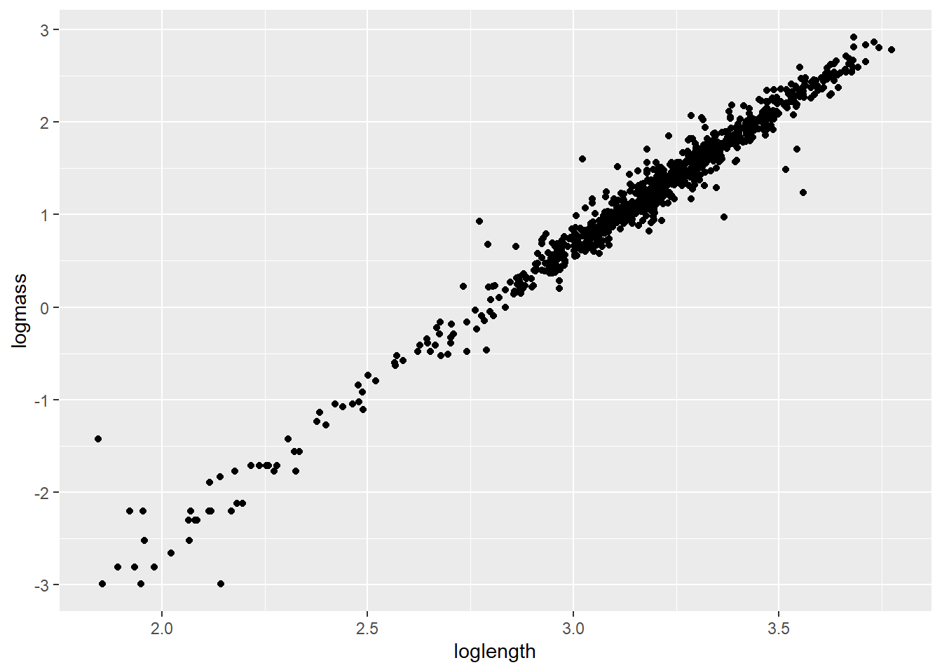
If nothing else, this tells me we need to go after more small cray next summer. For now, let’s get rid of all crayfish weighing less than 1 g because the data are sparse down there and small values are known to cause some trouble in these kinds of models [still refusing to provide citations].
Now, let’s take a look at the residual diagnostics for a linear model that includes a group effect of site and (of course) length as explanatory variables that we will use to predict changes in our response of interest, mass.
testmod <- lm(logmass ~ loglength + site, data = cray)

ggplot(testmod, aes(x = site, y = .resid, fill = site, color = site)) +
  geom_violin(alpha = 0.20, trim = FALSE) +
  geom_jitter(width = 0.1, alpha = 0.20)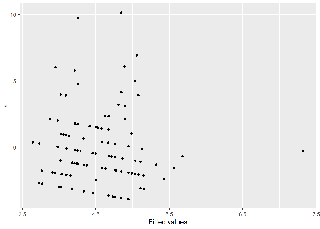
These look pretty good over all, but you should recognize at this point that we may have some concerns about whether or not variances are equal between groups, and whether observations at each site can really be considered independent (they cannot).
Next, we will take a look at a few different ways to analyze these data using maximum likelihood estimation. Our goal here is to estimate the relationship between length and mass while accounting for inherent variability between sites.
19.3.1 Random-intercepts model
First, we will analyze the data assuming that the intercepts for our linear model can vary between populations, but the relationship between length and mass is the same across all populations. This is a very common approach in many ecological and biological applications, as it often is the case that we are just trying to account for sampling design when we do this kind of analysis.
This is really straightforward to do in R. First, load the rstanarm package if you didn’t do it at the start of the chapter.
Next, we fit the model. To do this we will use the lmer() function. Notice that now we have to add an argument to specify a random effect of site on the intercept 1. This is our way of telling R that we want to account for site-specific variability in the length-mass relationship.
Being responsible individuals, we now have a look at the residuals to make sure we’ve met assumptions of normality and homoscedasticity:
# Get the residuals
cray_resids <- data.frame(cray, .resid = craymod$residuals)

# Plot the residuals
ggplot(cray_resids,
       aes(x = site, y = .resid, fill = site, color = site)) +
  geom_violin(alpha = 0.20, trim = FALSE) +
  geom_jitter(width = 0.1, alpha = 0.20)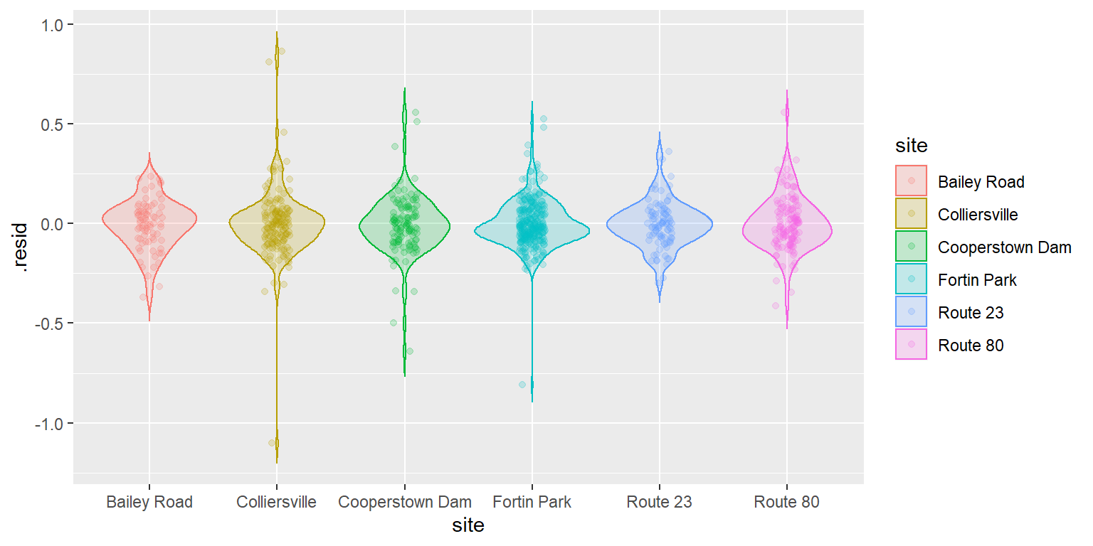
That’s looking about as good as we could hope for, so you can go ahead and crack open the model summary if that is your thing.
For now, I will skip the usual walk through of all the wonderful tidbits that R has to offer and cut right to the chase.
The default coefficient plot from the plot() function for this model is not super helpful. It shows us that there is clearly a significant relationship between length and mass, but we knew that coming into this. The intercept-adjustments are difficult to interpret in this case because of the scale of the intercept, which now doesn’t have much interpretation other than the “average” logmass of fish at loglength = 0. We can extract the site-specific intercepts to see if these are different from zero (which would mean they differ from the “average”).
Wow, that is so ridiculously easy to do now.
Now that we have the coefficients in a dataframe, we can clean up the names a little to make the plots a little nicer:
# First strip out that awful front-end text
names(coeffs) <- gsub(pattern = "b..Intercept..site.",
                      replacement = "",
                      x = names(coeffs)
                      )
Now we can stack the coefficients:
# Just grab the columns we want to work with here
intercepts <- coeffs[ , 3:8]

# Now stack them with pivot_longer
intercepts <- intercepts %>%
  pivot_longer(cols = c(1:6),
               names_to = "Parameter",
               values_to = "Estimate")
Calculate some summary statistics (95% CRI)
int_summary <- intercepts %>%
  group_by(Parameter) %>%
  summarize(fit = mean(Estimate),
            lwr = quantile(Estimate, 0.025),
            upr = quantile(Estimate, 0.975)
            )
And then you can plot them to see whether zero is excluded.
ggplot(int_summary, aes(x = Parameter, y = fit)) +
  geom_point(size = 2) +
  geom_segment(aes(xend = Parameter, y = lwr, yend = upr))
As in Chapter 14 we see that we probably don’t “need” to include these random intercepts if we are thinking about group-specific variability as strictly being a nuisance. But, we are here to incorporate that variability directly, so we’ll keep it!
Next, let’s make some predictions about the relationship between length and mass in each site.
This is the first time we will diverge from the MLE estimation technique used in Chapter 14. Rather than using the predict() function as we have been, let’s use the predict_posterior() function to make predictions from the posterior distribution of our model parameters. Notice that we are inverting the log link function on the fly in the lines below after we derive descriptive statistics of interest.
# Log-scale posterior predictions
lpred_mat <- data.frame( posterior_predict(craymod) )

# Descriptive statistics, with log-link inverted
fit <- exp( apply(lpred_mat, 2, mean) )
lwr <- exp( apply(lpred_mat, 2, quantile, probs = 0.025) )
upr <- exp( apply(lpred_mat, 2, quantile, probs = 0.975) )

# Smash it all together
cray_preds <- data.frame(cray, fit, lwr, upr)
Now we can plot our predictions by treating this just like any other model:
ggplot(cray_preds, aes(x = length, y = mass, color = site, fill = site)) +
  geom_point(alpha = 0.10) +
  geom_line(aes(y = fit), lwd = 1, alpha = 0.50) +
  xlab("Carapace length (mm)") +
  ylab("Mass (g)")
This is helpful for identifying some of the differences between sites. In this case, it looks like we have slightly smaller crayfish in a handful of sites (Bailey Road, Colliersville, and Route 80) and the rest of them look pretty similar. It can be difficult to see how our model fits the data for individual groups. Remember, that we could address this by using a quick facet_wrap() in our plotting code:
ggplot(cray_preds, aes(x = length, y = mass, color = site, fill = site)) +
  geom_point(alpha = 0.10) +
  geom_line(aes(y = fit), lwd = 1, alpha = 0.50) +
  xlab("Carapace length (mm)") +
  ylab("Mass (g)") +
  facet_wrap(~site)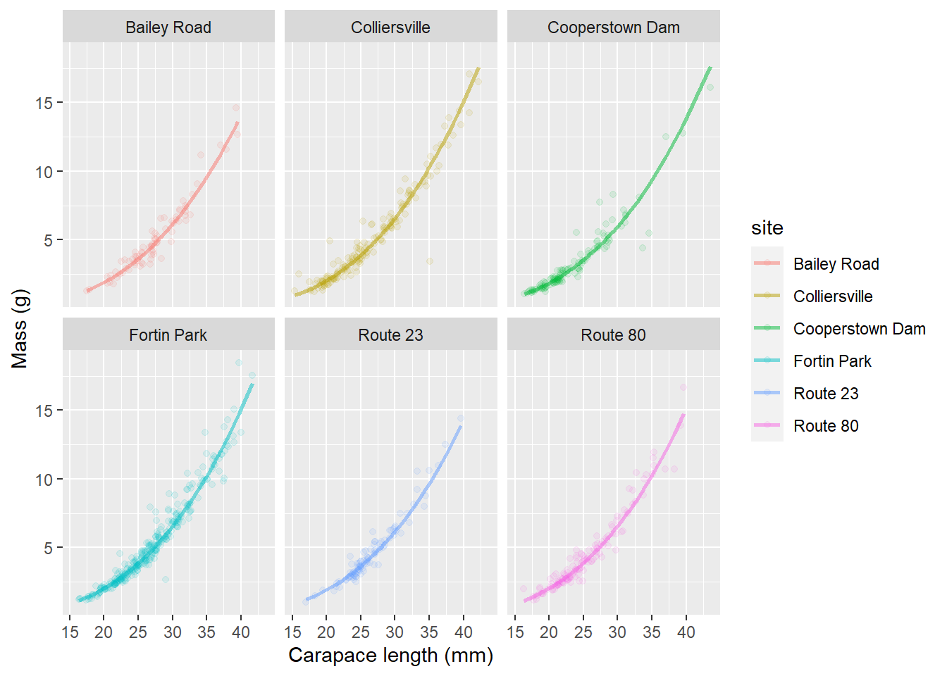
This let’s us see how well our predictions fit the data from individual streams all alongside the uncertainty in our estimates (even though there isn’t much!!).
As with LMM in the REML framework, this may seem like a lot of work at first glance, but hopefully you do realize that it is about the same amount of code as making predictions from linear models and general linear models, and now we have introduced yet another way to dealing with violations of assumptions!