Diagnostics and effect sizes

Introduction
The objective of this assignment is to take a step back and evaluate the assumptions that we make when we conduct parametric tests and create linear models that we use to test hypotheses or make predictions. This week we will start with how we can test our assumptions, and then move on to how we communicate our results with respect to effects of explanatory variables on our response of interest.
This assignment will continue to build on our work with linear models in R, and will help us understand exactly why we use these methods, how we use them to draw inference, and how to interpret the results. In addition to building these critical skills, the lab will also serve to set the stage for the next several weeks of class during which we will examine a more generalized framework (the GLM).
By the end of this lab, you should be able to: 1) conduct visual assessment of the validity of assumptions related to linear models on a case-by-case basis, and 2) be able to compute and communicate effects of explanatory variables on a response of interest.
We’ll be working with the tidyverse as always, so go ahead and load it when ready to start.
Exercises
Regression diagnostics
Let’s begin by doing some model diagnostics for a linear model. Remember, this should really be the first step, after data exploration, in any analysis that you conduct using linear models. Let’s start off this week with the ToothGrowth data that some of you explored during the first lab. These data are from an experiment that studied the effects of three different doses of Vitamin C using one of two supplement types on the length of guinea pig teeth. It’s a straight-up classic.
# Load the ToothGrowth dataset
data("ToothGrowth")

# To learn more about the data set, you can do
?ToothGrowth

# Take a look at the structure of the data
str(ToothGrowth)
Dose is stored as a numeric variable, and that makes intuitive sense. However, we only have three different doses, so if we are assuming that dose is numeric, then we also need to assume that it is being randomly sampled from a population of potential doses, which I think is clearly not the case here (otherwise we would have some that aren’t nice round numbers). So, we should probably convert this to a categorical variable. I am using chr below to avoid potential conflicts with factor levels when I go to make predictions.
# Convert the dose variable to a character string
ToothGrowth$dose <- as.character(ToothGrowth$dose)
Now, let’s get to diagnosing.
The first thing we will do is check to see if the distributions of the data are normal within groups. We can do this with a couple of tools. First, make a box plot of tooth length ('len') as a function of supplement type and dose.
Question 1. Based on the box plot, does it appear that the distribution of tooth lengths is fairly normal within doses? What other kinds of plots could you use to visually inspect these distributions (note: not the residuals yet)?
Next, we can look at the actual regression diagnostics to examine whether or not we are in major violation of assumptions about the residuals in our model. Remember, the assumptions related to the residuals are 1) they are normally distributed with a mean of zero, 2) homogeneity of variance, and 3) independence of observations.
Start by fitting a model to test the additive effects of the supplement (supp) and dose (dose) on tooth length (len) in guinea pigs.
# Remember to store the model as an object,
# like this, replacing the '...' in
# parentheses with the appropriate
# formula and data arguments. Cruel, #Iknow.
tooth.mod <- lm(...)
Next, graph the diagnostic plots of the residual error for the fitted model object using the examples from Chapter 9.6. Do realize that now we have a two-factor ANOVA, so you may want to add facet_wrap() to your plotting function like we did for the predictive plots in Chapter 10.2. For example, if I wanted to do this for a cruddy violin plot of the raw data it might look like this:
ggplot(ToothGrowth, aes(x = supp, y = len, fill = supp)) +
  geom_violin(alpha = 0.2) +
  geom_jitter(aes(color = supp), width = .2, alpha = .5) +
  facet_wrap(~dose)
That should get you started. Now, you just need to do this for the residuals instead of the raw data.You can plot all of the residuals at once, split them into VC vs OJ, look at them by dose, or look at them in groups by dose and groups all at once.
Question 2. Based on our discussions about residual plots this week and the examples in Chapter 9.6 does it appear that the residuals in the plots you made are (more or less) normally distributed with a mean of zero? How did you come to this conclusion?
Question 3. Based on the residual plots you have made and our discussions, does it appear that your model violates the assumption about homogeneity of variances? How did you come to this conclusion?
Interpreting main effects
Once you are satisfied that you have adequately reviewed the diagnostic plots and developed an opinion about whether or not we are violating assumptions, let’s move on and do the analysis one way or another.
Now that we’ve done a little model validation to assure that we are not completely blowing the assumptions of linear models, it is time to take a look at our results (You may have concluded something different in your previous answer - totally fine. I will show you residual train wrecks moving forward that make these ones look great!). We will do this one step at a time. First, print the output of your model using the anova function to determine whether or not the main effects of each explanatory variable were significant.
# Get the ANOVA table for your model,
# replacing 'tooth.mod' with
# whatever you named the model object.
anova(tooth.mod)
Question 4. Were there significant effects of supplement and/or dose on guinea pig tooth length? Report these along with F-statistic, df, and the p-value.
Question 5. How much of the variability in guinea pig tooth length was explained by the additive effects of supplement and dose? Remember, there are multiple ways to find this information. If you can’t remember either method, check out Chapter 7 or Google it.
If you haven’t already done so, print a summary of the linear model so you can see the regression coefficients. Using what you learned in class this week, and the example in Chapter 10.2, predict the mean expected value of tooth length for each combination of supp and dose from your model. Remember: there are multiple ways to do this. You can do the math by hand, or you can use the built-in predict() function in R. Just pay close attention to how you do this, and make sure that your predictions make reasonable sense (they should if you do it correctly). You only need to do one or the other here.
Question 6. Report the model-predicted tooth length for each combination of supp and dose. Tabular output from R is fine for this one.
Next, calculate the observed mean of tooth length for each combination of supp and dose. The easiest way to do this is with our now standard data summary pipeline.
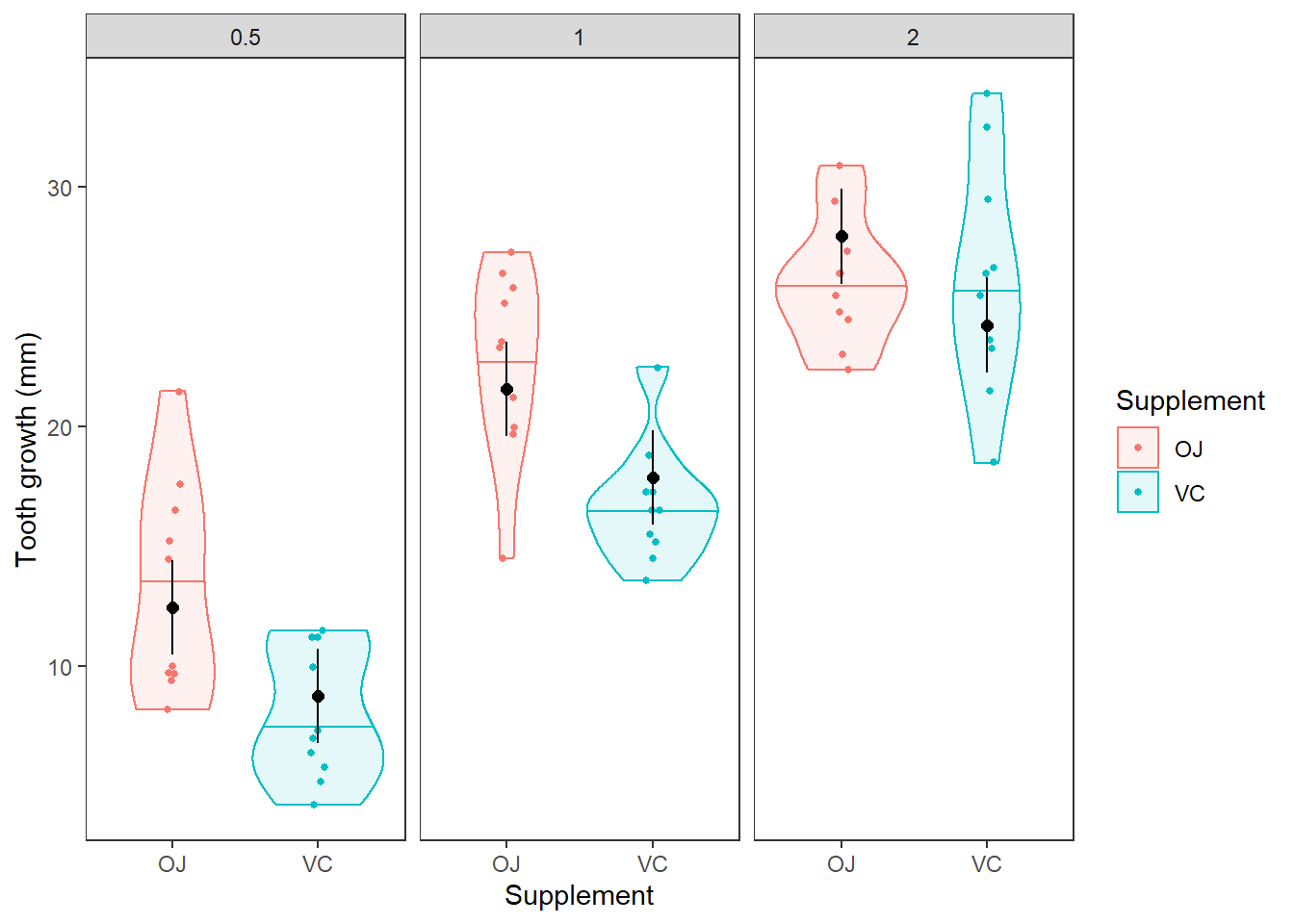
Question 7. Do the model predictions of tooth length for each combination of supplement and dose approximate the values and patterns in the observed data reasonably well? Describe any discrepencies you notice. It may be helpful to plot the predictions against the raw data as we did for two-way ANOVA in Chapter 10.2. In the figure below, the horizontal lines in the violins are the medians. The black dots with error bars are our mean and 95% CI from the model.
Interpreting interactions
Okay, now that you’ve had a chance to examine the simple model and take note of some differences between the observed data and the predictions, let’s go ahead and step up the complexity a little more.
The reason that our predictions did not match the observed data exactly is because the model that we built allowed for different intercepts between the two levels of supp, but did not allow the effect of dose to differ between supplementation types. In order to account for this, we can include an interaction in our model, like we talked about in Chapter 10.2.2.
Go ahead and fit a new model to the ToothGrowth data. This time include the interaction between supp and dose. Once you’ve fit the model, summarize it using both the anova function and the summary function.
Question 8. Is the interaction term in this model significant?
Question 9. How much variability in guinea pig tooth length is explained by this model? Is that more or less than the model that did not include the interaction?
Finally, use the example from Chapter 10.2 to plot the predictions of the interaction model, as I have done above for the main-effects model. We can make the necessary group combinations into a dataframe for the predict() function like this:
# Load the ToothGrowth dataset
data("ToothGrowth")

# Convert dose to factor
ToothGrowth$dose <- as.character(ToothGrowth$dose)

# Run the model
tooth.mod <- lm(len ~ supp * dose, data = ToothGrowth)

# Get group combinations
groups <- data.frame(
  with(ToothGrowth, unique(data.frame(supp, dose)))
)
Now, you can make predictions using the predict() function. Or, if you are a total masochist, you can do the matrix math directly using the examples in Chapter 10.1.
Once you have the predictions, plot the observed data and add your predictions to the plots.
Question 10. Now that you’ve had a chance to look at these things side by side, does the interaction model appear to make more intuitive sense than the main effects model? Is this supported by the amount of variability is explained by each of the models (think R2)?
Wouldn’t it be nice to have some kind of really reliable statistic or group of statistical tool that you could use to clearly demonstrate this difference? Tune back in next week for more on this topic.
This work is licensed under a Creative Commons Attribution 4.0 International License. Data are provided for educational purposes only unless otherwise noted.