Introductory fisheries statistics in R
![]()
Introduction
Now that we have looked at some of the basic programming and common statistical tools in R, we can dive into some of the tools that have been created just for fish! There are a few packages for dealing with data from fish and fisheries, and we will just glance off the tip of the iceberg here to demonstrate a few common fisheries analyses. Hopefully you find, like many of us, that once you’ve tackled the code the first time it is easy to translate from one species or data set to another. And next time, you’ll have a head-start!
For this workshop, we will continue to work with
tidyverse for data manipulation and plotting, and we’ll use
the FSA package Ogle
et al. 2020 for some fisheries-specific functions that should free
up some time in your daily routine. We’ll need the nlstools
package to make predictions from growth curves we’ll fit with
nls(). And, we will use the plotrix package to
plot some of our FSA output. You’ll need to install these
packages first if you haven’t already. If you are working in RStudio,
you probably got a prompt to install them when you opened the workshop
script called fishStats.R if you’ve never worked with them
before.
You can load all of these packages when you are ready to get started:
library(tidyverse)
library(FSA)
library(nlstools)
library(plotrix)
Length-frequency histograms
Doing it ‘by hand’
Let’s start by reading in some grass carp (Ctenopharyngodon
idella) data from Lake Gaston, a large reservoir on the border of
North Carolina and Virginia in the heartland of contemporary triploid
grass carp population dynamics (hey, it’s a thing!). The data contain
information about year of collection (2006, 2007, 2009,
2010, and 2017), total length (tl), mass (kg),
and age assigned from otoliths for each of 419 individual
fish in cohorts(1994 - 2014). It also includes
information about modeled number of grass carp (n_gc),
estimated hectares of hydrilla (ha_hydrilla), and number
and biomass of grass carp per hectare of hydrilla. These data are from a
recent analysis by a
former New York Chapter AFS member and MS Lake Management student at
SUNY Oneonta Caves
et al. In press. If you are a member of American Fisheries Society you have
access to the early view of that article. Just sayin…
Shameless, I know, just read in the data file:
grasscarp <- read.csv("data/grasscarp.csv", stringsAsFactors = FALSE)Have a quick look at the first ten lines of the data
head(grasscarp, 10)
   year   tl   kg age cohort  n_gc ha_hydrilla n_ha  kg_gc kg_ha
1  2006 1262 23.2  12   1994 25128        1203   21 129929   108
2  2006  569  2.7   2   2004 25128        1203   21 129929   108
3  2006  504  2.2   2   2004 25128        1203   21 129929   108
4  2006  846  8.0   3   2003 25128        1203   21 129929   108
5  2006 1138 23.9  10   1996 25128        1203   21 129929   108
6  2006 1187 18.6  10   1996 25128        1203   21 129929   108
7  2006 1207 19.5  12   1994 25128        1203   21 129929   108
8  2006 1086 21.3  10   1996 25128        1203   21 129929   108
9  2006  525  2.9   2   2004 25128        1203   21 129929   108
10 2006  837  8.2   4   2002 25128        1203   21 129929   108
Take a quick look at the data structure
str(grasscarp)
'data.frame':   419 obs. of  10 variables:
 $ year       : int  2006 2006 2006 2006 2006 2006 2006 2006 2006 2006 ...
 $ tl         : int  1262 569 504 846 1138 1187 1207 1086 525 837 ...
 $ kg         : num  23.2 2.7 2.2 8 23.9 18.6 19.5 21.3 2.9 8.2 ...
 $ age        : int  12 2 2 3 10 10 12 10 2 4 ...
 $ cohort     : int  1994 2004 2004 2003 1996 1996 1994 1996 2004 2002 ...
 $ n_gc       : int  25128 25128 25128 25128 25128 25128 25128 25128 25128 25128 ...
 $ ha_hydrilla: int  1203 1203 1203 1203 1203 1203 1203 1203 1203 1203 ...
 $ n_ha       : int  21 21 21 21 21 21 21 21 21 21 ...
 $ kg_gc      : int  129929 129929 129929 129929 129929 129929 129929 129929 129929 129929 ...
 $ kg_ha      : int  108 108 108 108 108 108 108 108 108 108 ...
Don’t forget, you can even look at it like a spreadsheet!
View(grasscarp)Now, let’s make a basic l-f histogram of the grasscarp data. (You’ll
get some constructive feedback from stat_bin() in
ggplot2 about this. You can ignore it or use
geom_hist(bins = 25) if it really bothers you.)
# Make a histogram with all of the arguments set to their defaults
ggplot(grasscarp, aes(tl)) + geom_histogram()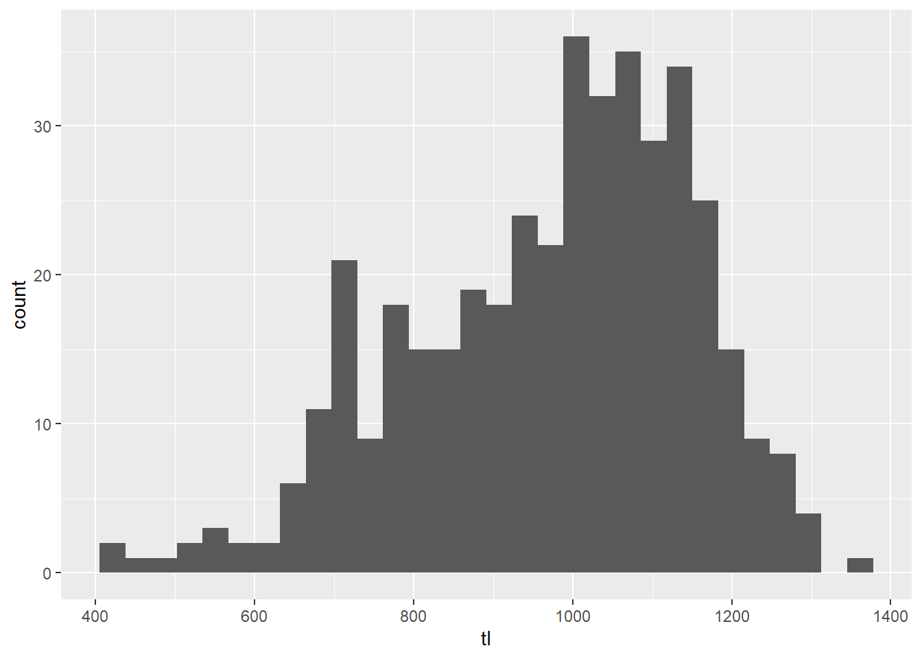
This is pretty ugly, and it doesn’t do a whole lot for us in terms of
biological meaning. We can modify this plot to use standard
breaks so that we can get, for example, 10-mm length bins
that may have more biological meaning for fisheries management.
# Make a histogram with 10-mm size bins
ggplot(grasscarp, aes(x = tl)) + geom_histogram(binwidth = 10)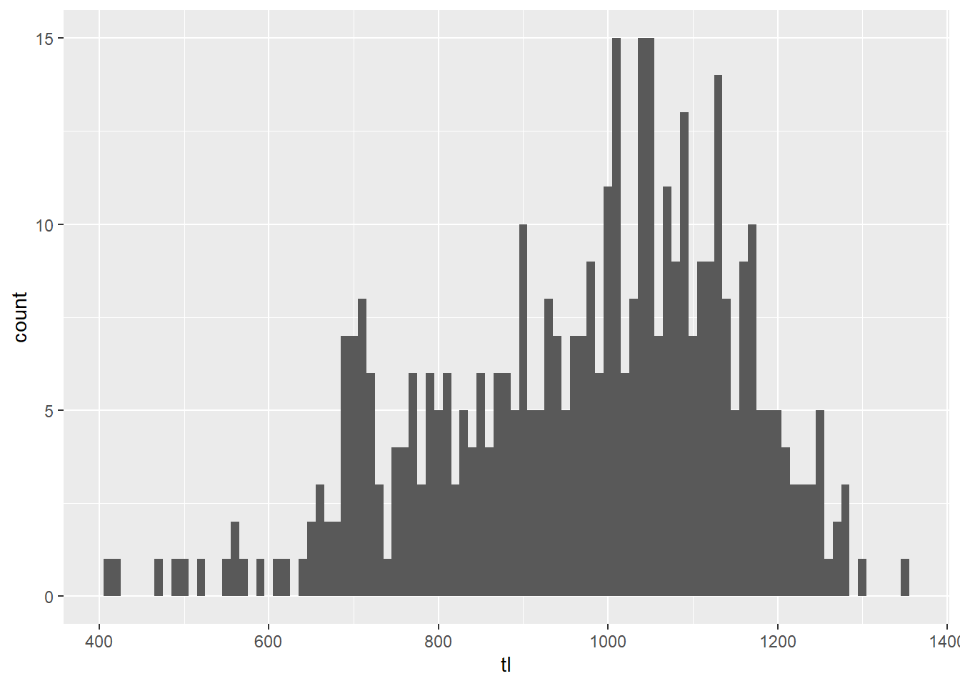
Wow, that is way easier than it used to be even in R. Thanks
ggplot()!
Okay, so this plot is better, but there is still a lot of ugly crap going on here. For one, the labels don’t work for me. The axes don’t cross at zero, and we have no color.
So, let’s fix it!!
First, let’s make a better looking histogram “by hand”.
# Make a histogram with 10-mm size bins
# But, make it pretty this time
ggplot(grasscarp, aes(x = tl)) +
  geom_histogram(binwidth = 10) +
  xlab("Total length (mm)") +
  ylab("Frequency") +
  theme_bw() +
  scale_y_continuous(limits = c(0, 15), expand = c(0.01, 0)) +
  theme(
    axis.title.x = element_text(vjust = -1),
    axis.title.y = element_text(vjust = 3)
  )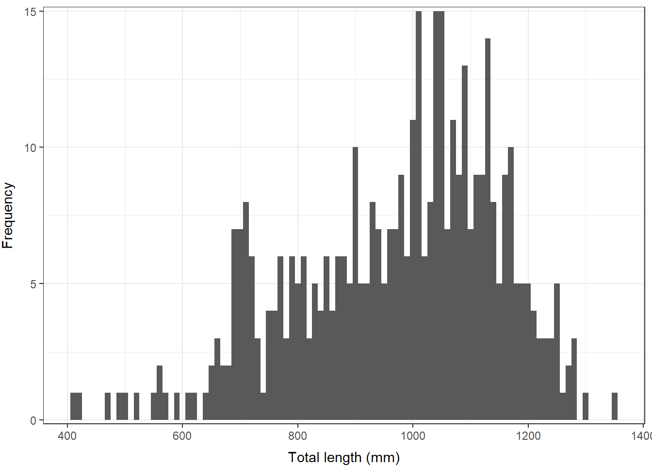
There, that looks a lot better. We might even think about putting
this in a report or an article. If you wanted to save it out as a
high-res image in that case, you could use the png(),
jpeg(), tiff() or other functions for saving
an image. You can check out any of these by running ?png in
the console to open the help files.
Doing it in the FSA package
We can make some pretty nice figures by hand, but this can be a lot to learn and not everyone is into it. Likewise we may wish to have a bunch of other standard output with our reproducible figures.
If we want a faster solution, there are a number of
packages that are maintained in R specifically for fish
data. The most comprehensive tool sets is are FSA and the
fishmethods packages. Here we will start to play with some
of the tools in FSA, following examples from the package
documentation, to see how some of the more common fish population
assessment tools work.
# Load the FSA library
library(FSA)
The FSA package contains a lot of really cool tools that
make life a lot easier. And, you can even get an introductory fisheries
statistics book (Ogle 2016)
that goes along with it. We will cover some basic applications here, but
realize that this package can be used for a whole lot of other stuff,
and now includes much of what previously was housed in many different
places.
For example, if we wanted to create a length-frequency histogram that shows some of the Gabelhouse length categories, we could do it like this:
# Make an l-f histogram that includes Gabelhouse lengths
psdPlot(~tl, # Tell R the name of your length data
  data = grasscarp, # Tell it the name of the data frame
  species = "Grass Carp", # Pass species
  w = 10 # Tell R how wide length-bins are
)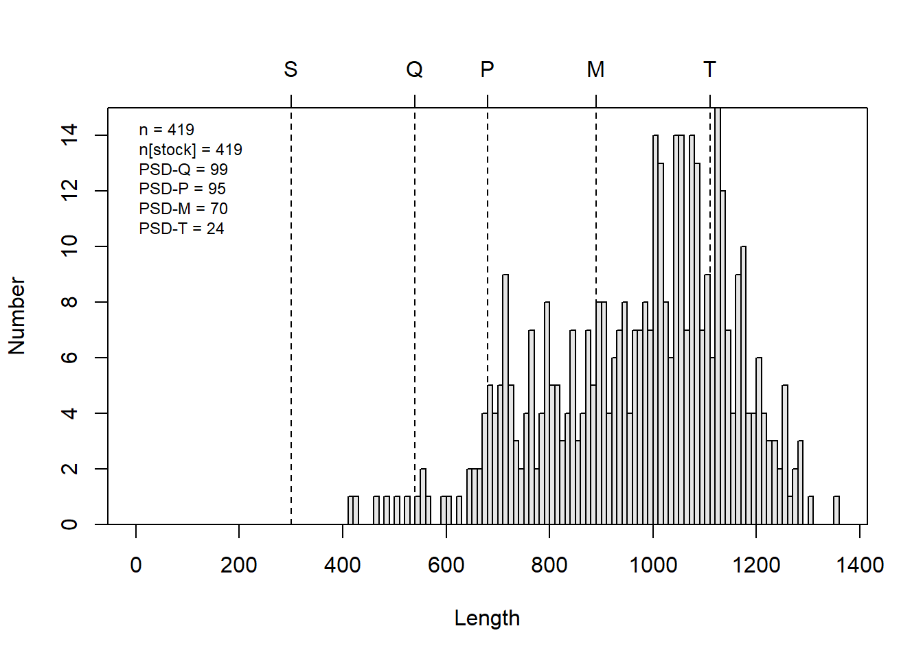
This is a heck of a lot easier than going through all of that other
stuff if what we want is an l-f histogram with all of this info on it.
You can, of course still customize what is displayed on the plot using
optional arguments when you call psdPlot(). Remember that
you can see these arguments, their default values, and their optional
values by running ?psdPlot.
PSD calculations and plotting
The plots we used above are neat, but if what we are really after are
the numbers or a tic-tac-toe graph for multiple species, then this is
only going to give us part of what we want. Luckily, there are other
tools for that stuff in the FSA package.
We will demonstrate PSD calculations in R using the FSA
package here. Note that these functions are for convenience only, and
you could totally do it by hand in R if you were
inclined…ha!
# Calculate PSD for Gabelhouse length categories
# and each of the intervals
psdCalc(~tl,
  data = grasscarp,
  species = "Grass Carp",
  digits = 1
)
        Estimate 95% LCI 95% UCI
PSD-Q       98.6    96.8   100.0
PSD-P       94.5    91.1    97.9
PSD-M       70.4    63.5    77.3
PSD-T       24.3    17.9    30.8
PSD S-Q      1.4     0.0     3.2
PSD Q-P      4.1     1.1     7.0
PSD P-M     24.1    17.7    30.5
PSD M-T     46.1    38.6    53.6
If you take a close look at the output, you can see that we not only get point estimates for each of the standard length categories we normally care about, but we also get 95% confidence intervals from those estimates! Very cool…about how long do you think that would have taken you to do from scratch for the first time in Excel?
Tic-tac-toe plots
The psdCalc() function is really great for calculating
PSD for one species, but we are often interested in comparing PSD of
predator and prey simultaneously, and graphically, for gauging things
like ‘balance’ in fish communities.
So, let’s pretend we have some predator-prey data for which we have already calculated PSD.
We will start by making up (er, simulating) data for predator PSD and prey PSD with 95% Confidence intervals.
# Make up mean and 95% CI of PSD for each species
prey <- c(45, 30, 55)
pred <- c(25, 10, 37)

# Give names to the values in each of those objects
names(prey) <- names(pred) <- c("Estimate", "95% LCI", "95% UCI")
Print predator and prey objects as a dataframe to see what they look like
rbind(prey, pred)
     Estimate 95% LCI 95% UCI
prey       45      30      55
pred       25      10      37
Next, we will make a blank plotting window for our
tictactoe() plot.
tictactoe(
  predobj = c(30, 70),
  preyobj = c(30, 70),
  predlab = "Predator PSD",
  preylab = "Prey PSD", obj.col = "black",
  obj.trans = 0.2,
  bnd.col = "black",
  bnd.lwd = 1,
  bnd.lty = 2
)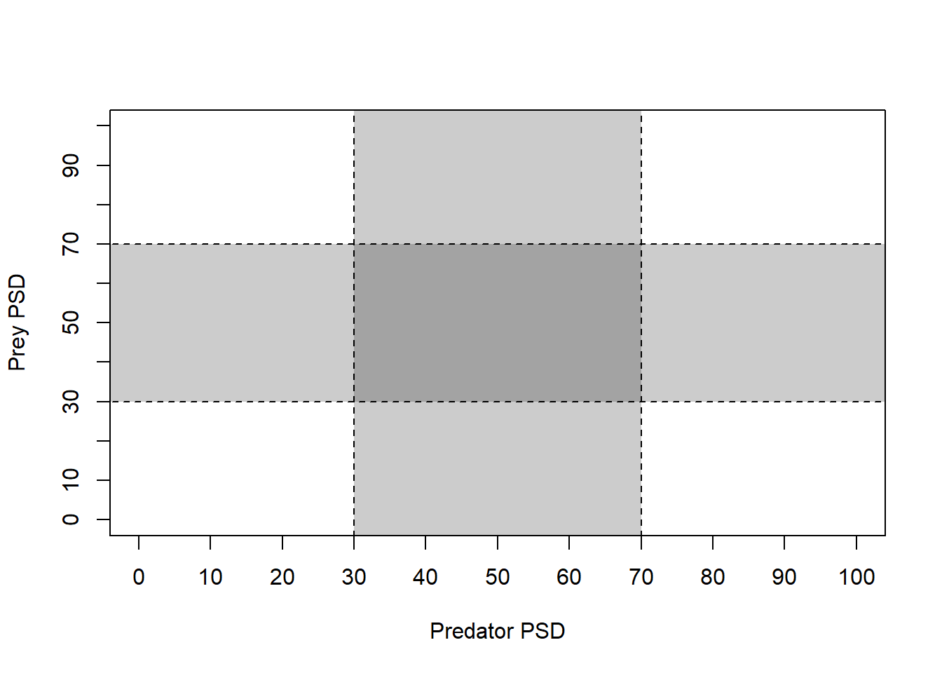
Now, that gives us a really nice blank plot! What about the data?
Well, we can add the data on our tic-tac-toe plot, of course.
# Load the `plotrix` package for the
# `plotCI` function first. You may need
# to install this if it didn't automatically
# install with `FSA`
library(plotrix)

# Plot the PSD and the confidence intervals
plotCI(prey[1], pred[1],
  li = prey[2], ui = prey[3],
  err = "x", pch = 16, add = TRUE
)
plotCI(prey[1], pred[1],
  li = pred[2], ui = pred[3],
  err = "y", pch = 16, add = TRUE
)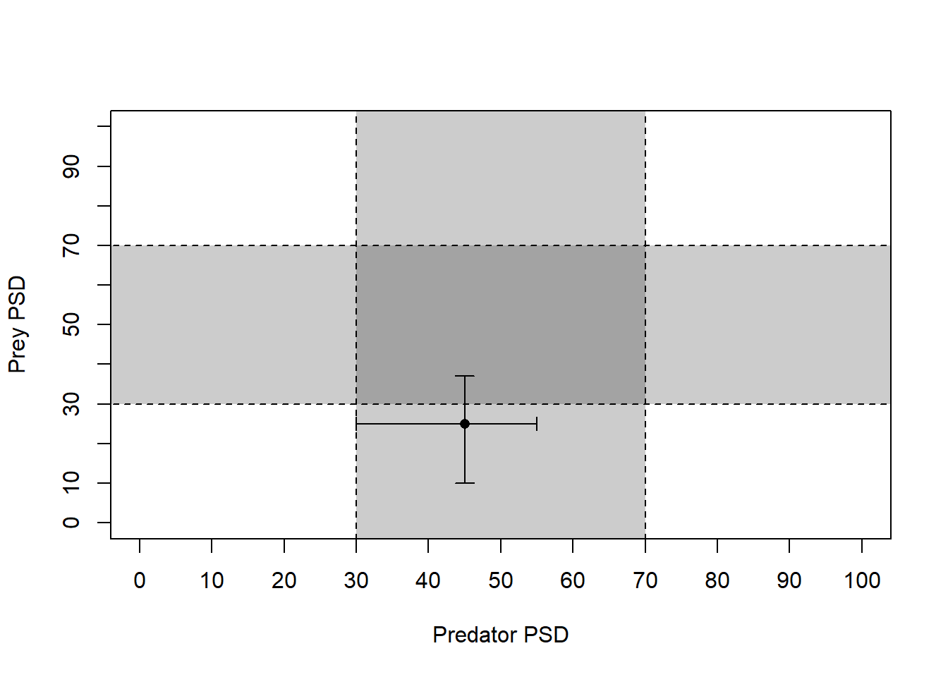
Beautiful…Again, think back to the first time you made a tic-tac-toe plot in any other program - about how long did that take again? And could you re-use that plot with a new data set?
Estimating growth curves
Individual growth, based on length-at-age data can be really useful information when we are developing stock assessments on which we will eventually base fishery management decisions. Growth parameters are central to estimating fish mortality by indirect methods when “empirical” estimates are lacking and often form the basis for yield-per-recruit models that we use to predict effects of catch limits and size limits and develop regulations. There are a number of different tools that we can use to estimate growth curves in R, and many different growth curves that we may wish to fit.
The most commonly used growth curve for length-at-age data is the von Bertalanffy growth model, but there are a whole bunch of others that may be way better depending on the biology of the fish you are studying and any number of other factors. We can estimate these models using either individual length-at-age data, or by using population means. At a basic level we should get virtually identical answers as long as the data are representative. If we have the data, use of individual measurements is generally preferred, and R is a great way to do this.
Let’s look at an example. There are a couple of different ways we can go about fitting grwoth curves in R. All of them require that we pick some kind of growth model, and that we provide starting values for the parameters in that model. The parameters are quantities that govern the shape of the growth curve, and that we (usually) need to estimate from the data.
I know, sounds confusing, but the math is actually more straightforward than the funny polynomial lines you may have fit to length-age data in Excel when nobody was looking (don’t do that!!).
We’ll keep working with the grasscarp data for this
one.
First, we need to define the von Bertalanffy growth model as an
object so R can see it. Important: I am using
tl and age below because those are the names
of the columns in my data that hold length and age data. You will need
to change that if you have different names for those columns in your
data!
# Define von Bertalanffy growth function
vbmod <- tl ~ Linf * (1 - exp(-K * (age - t0)))
Now, we can pass this on to a non-linear optimizer, just like you
might do with the “Solver” add-in for Excel. But first, we need to come
up with some starting values. Without any prior knowledge of the study
population this can be tough. But, we can get some starting values for
our parameters (Linf, K, and t0)
using the FSA package.
# Get starting values for each of your
# parameters using the `vbStarts` function
# from `FSA`
starts <- vbStarts(formula = tl ~ age, data = grasscarp)
Now, we have a list of starting values that we can use
to start estimating the growth function.
# Have a look at the starting values for
# the parameters.
starts
$Linf
[1] 1082.361

$K
[1] 0.3282342

$t0
[1] -0.4778118
With these in hand, we can finally estimate the parameters for the von Bertalanffy growth function for these fishies:
# Fit the von Bertalanffy growth function using
# nonlinear least squares (nls) optimization
mymod <- nls(vbmod, data = grasscarp, start = starts)
And, at long last we can have a look at the parameter estimates like this:
# Show model summary
summary(mymod)

Formula: tl ~ Linf * (1 - exp(-K * (age - t0)))

Parameters:
       Estimate Std. Error t value Pr(>|t|)
Linf 1132.24913   13.35187  84.801  < 2e-16 ***
K       0.20361    0.01869  10.892  < 2e-16 ***
t0     -2.20748    0.40660  -5.429 9.65e-08 ***
---
Signif. codes:  0 '***' 0.001 '**' 0.01 '*' 0.05 '.' 0.1 ' ' 1

Residual standard error: 91.56 on 416 degrees of freedom

Number of iterations to convergence: 4
Achieved convergence tolerance: 3.834e-06
We can predict mean length at age for each observation in our data
set or from new data. For ease of plotting, we’ll predict
tl from observed age in the
grasscarp data using the default predict()
function:
pred <- predict(mymod)But, we are scientists, so we’d also like to get some confidence
intervals for those predictions. At the time of writing, this still
hasn’t been implemented but we can use a boot-strap approach to estimate
mean length at age and confidence intervals for now. We’ll add a couple
steps to follow the usual workflow from FSA here using the
same typical von Bertalanffy growth model we defined above
in vbmod.
# Get the desired growth function from a list
# of those that are available in FSA
vbO <- vbFuns("typical")

# Fit the model to the data using nls, like we did before
vb_fit <- nls(tl~vbO(age,Linf,K, t0), data=grasscarp, start=starts)

# Now, bootstrap the model fitting process
boot_fit <- nlsBoot(vb_fit)

# Predict length at age from the model
# t is age. Here, we tell R to predict
# length at each unique age in our original
# data, and calculate some bootstrapped confidence
# intervals
boot_preds <- data.frame(
  predict(boot_fit, vbO, t = sort(unique(grasscarp$age))))
Have a look at boot_preds in the data viewer if you want
to see what this looks like.
We’ll want to change the names to make things more convenient here. I
am going to use the standard R names for predicted mean
(fit), lower 95% (lwr), and upper 95%
(upr) that are output from the default
predict() function so I don’t have to change the plotting
code that I’m about to copy and paste for the next two sections!
names(boot_preds) <- c("age", "fit", "lwr", "upr")Go ahead and merge the boot-strapped predictions and confidence intervals back into our original data set, again just for convenience in the plotting routine that follows
grasscarp_preds <- merge(grasscarp, boot_preds, by = "age")And finally, we can plot our predictions against the raw data. Here,
we make use of the alpha argument in different geometries
so we can see density of raw data points and the confidence bands around
our predictions all at once.
ggplot(grasscarp_preds, aes(x = age, y = tl)) +
  geom_jitter(width = 0.1, alpha = 0.15, size = 2) +
  geom_line(aes(y = fit)) +
  geom_ribbon(
    aes(x = age, ymin = lwr, ymax = upr, color = NULL), alpha = 0.3) +
  xlab("Age (years)") +
  ylab("Total length (mm)") +
  theme_bw()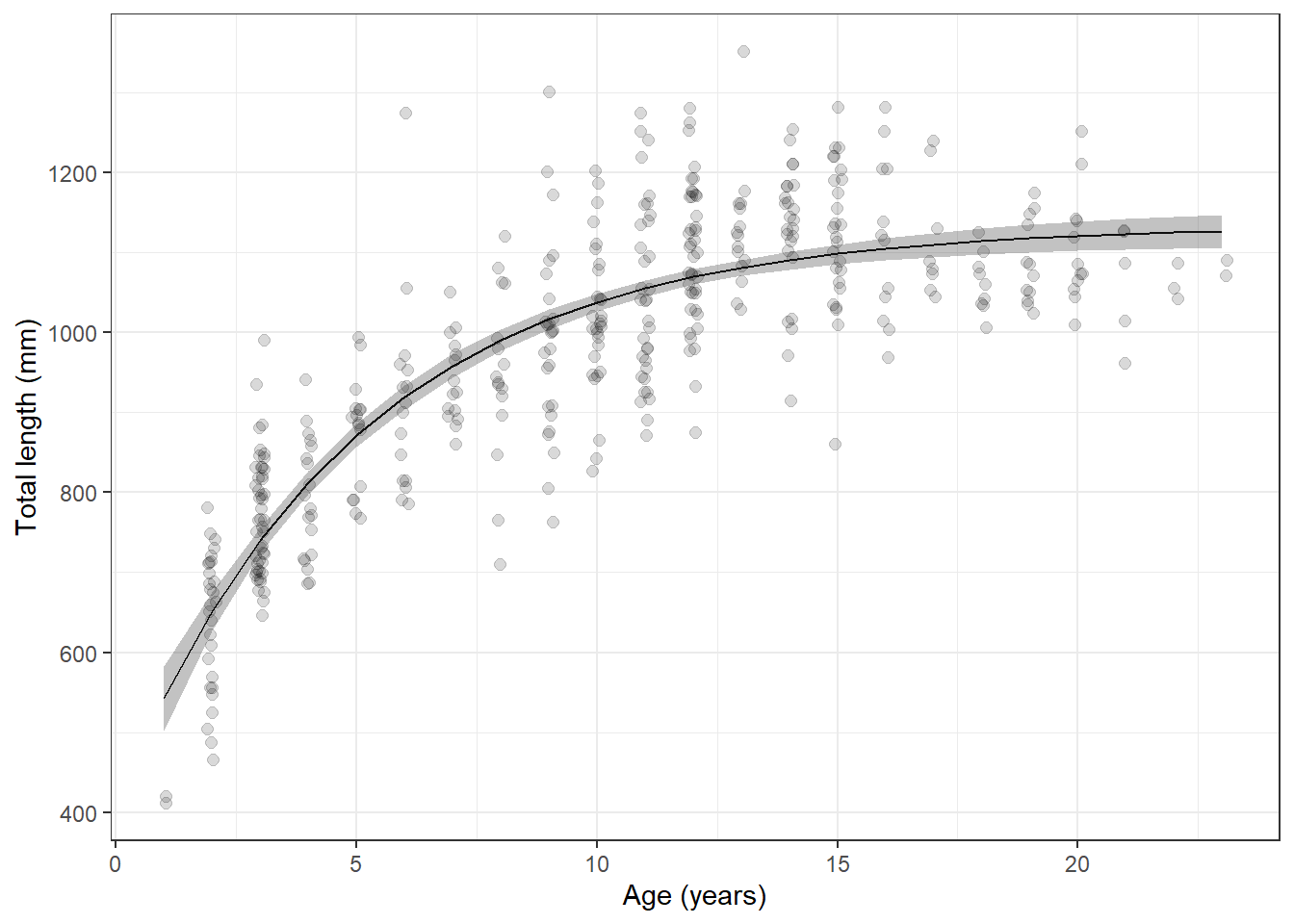
Sweet, sweet carpiness.
Length-weight regression
Compared to non-linear regression, linear regression is really straightforward in R. Let’s demonstrate quickly with the log10(weight)-log10(length) relationship with which most of you are familiar.
Start by transforming, or mutate()-ing the length and
mass data:
lw_data <- grasscarp %>%
  filter(!is.na(kg)) %>%
  mutate(loglength = log10(tl), logkg = log10(kg))
Now we can fit a linear regression using the lm()
function in R:
lw_mod <- lm(logkg~loglength, data = lw_data)We can look at the output of summary() for the model to
get the coefficients, estimated standard errors, and R2 for
the fit:
summary(lw_mod)

Call:
lm(formula = logkg ~ loglength, data = lw_data)

Residuals:
     Min       1Q   Median       3Q      Max
-0.98443 -0.04438 -0.00431  0.04574  0.24221

Coefficients:
            Estimate Std. Error t value Pr(>|t|)
(Intercept) -7.04259    0.17208  -40.93   <2e-16 ***
loglength    2.72395    0.05774   47.17   <2e-16 ***
---
Signif. codes:  0 '***' 0.001 '**' 0.01 '*' 0.05 '.' 0.1 ' ' 1

Residual standard error: 0.08762 on 347 degrees of freedom
Multiple R-squared:  0.8651,    Adjusted R-squared:  0.8647
F-statistic:  2226 on 1 and 347 DF,  p-value: < 2.2e-16
And, it is super easy to make log-scale predictions for comparison against our raw data:
log_preds <- data.frame(predict(lw_mod, interval = "confidence"))We can even get these back on the real scale:
preds <- apply(X = log_preds, MARGIN = 2, FUN = function(x){10^x})Add that back to the raw data:
lw_preds <- data.frame(lw_data, preds)And now we can plot our predictions
ggplot(lw_preds, aes(x = tl, y = kg)) +
  geom_jitter(width = 0.1, alpha = 0.15, size = 2) +
  geom_line(aes(y = fit)) +
  geom_ribbon(
    aes(x = tl, ymin = lwr, ymax = upr, color = NULL), alpha = 0.3) +
  xlab("Total length (mm)") +
  ylab("Mass (kg)") +
  theme_bw()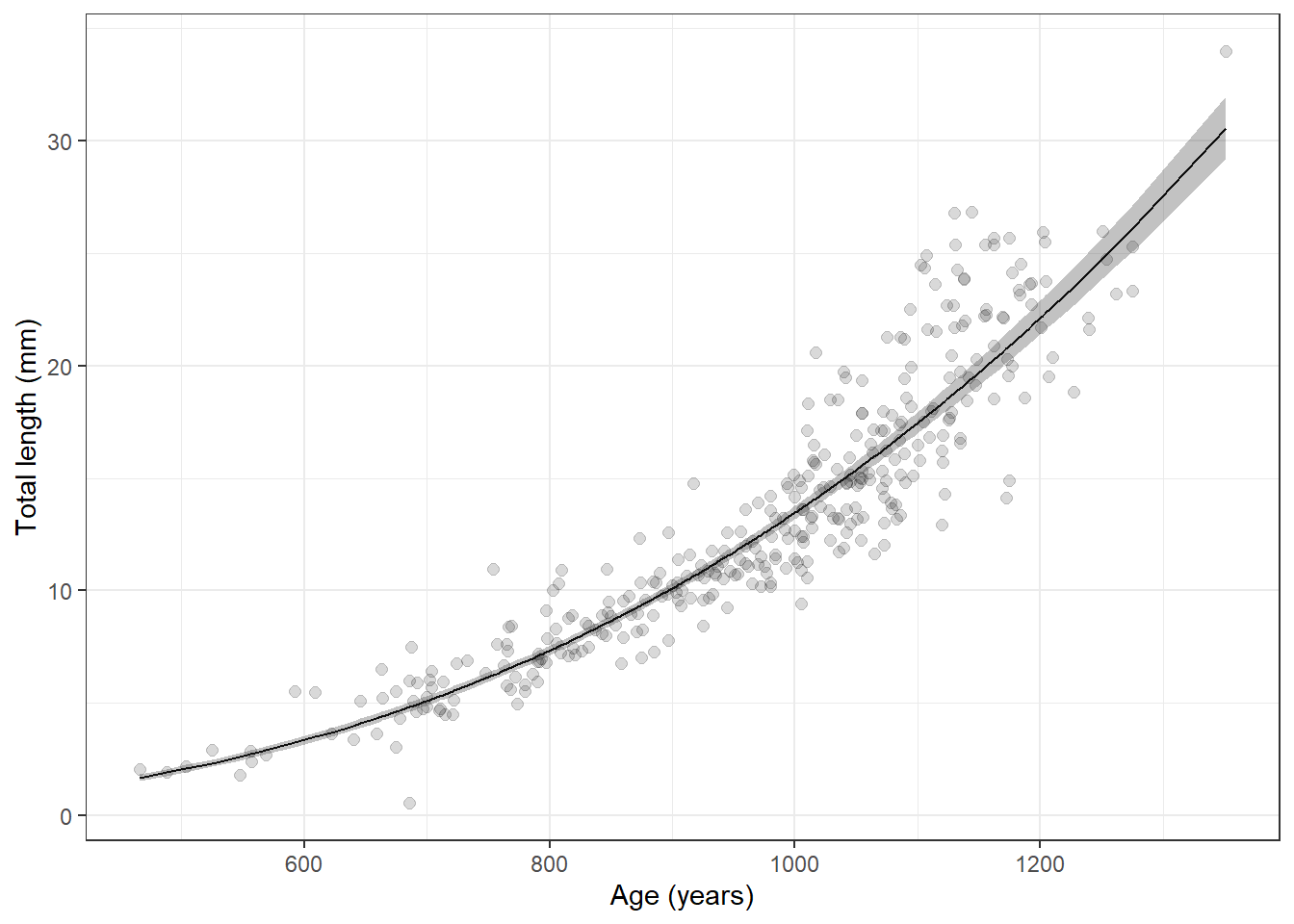
Wow, that is way to convenient. Did you notice that the only thing I
changed in the plotting code was the names of the data (x
and y)?
Closing remarks
Okay, if that’s not all we have time for we can poke around with some other stuff when we meet. But, this should at least demystify a little bit of R for you, and hopefully it gives you the chance to get into some of this on your own. When in doubt, remember that good information is still available in those paper objects called books, but Google is really your BFF when it comes to getting help with R.
This work is licensed under a Creative Commons Attribution 4.0 International License.